Cultural Construction

Enterprise VI
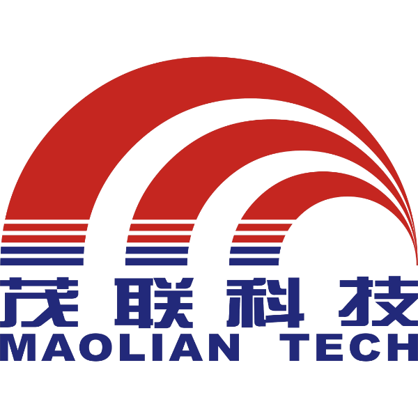
The company logo is the core of the company's visual identity system and the cohesion of the company's corporate spirit at a specific development stage. It will directly affect and know the next development of the company. The logo of Tianjin Maolian Technology Co., Ltd. boldly introduces new concepts in color and structure, which further highlights the brand image of Maolian Technology Co., Ltd.'s innovation, environmental protection, high-end and vitality. The main colors of the logo are eosin red and sea blue.
Eosin:
The color of the rising sun represents enthusiasm, unrestrainedness and vitality, symbolizing passion and dynamic red, which increases the vividness and affinity of the corporate image, and gives people a strong visual impact. It is consistent with the dynamic and innovative corporate brand positioning.
Sea Blue:
The most inclusive and cohesive, stable and noble color, blue is the color of science and technology, symbolizing that the company is a high-tech enterprise based on technological innovation. The combination of red and blue has a visual aesthetic of stable harmony and tension.
View into connotation:
The round red shape is like a rising sun, and the blue stripes suggest the ripples of the sea level. The overall appearance highlights the power and momentum of the sun leaping out of the sea, and highlights the company's thriving development prospects as a new energy industry.
